
About Radix UI
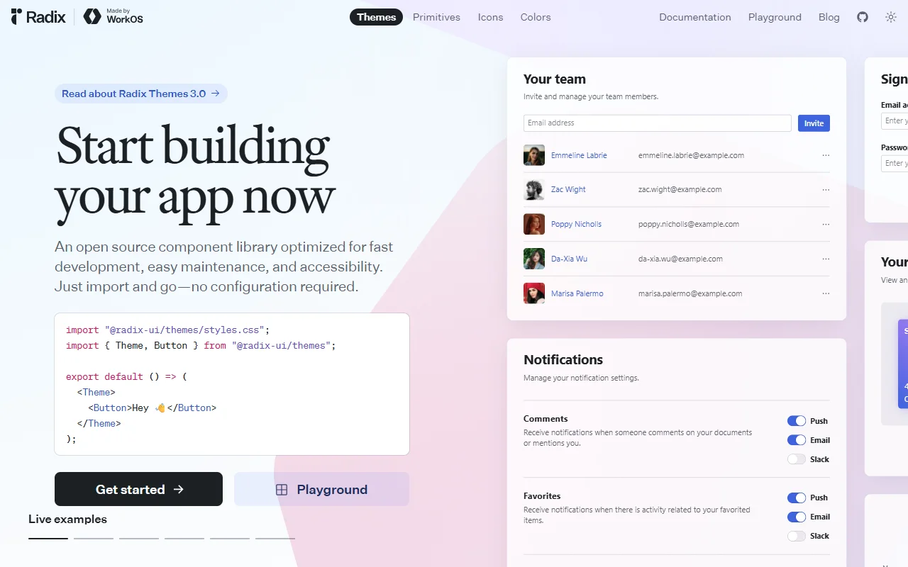
Radix UI is a collection of open source components for building accessible user interfaces. It provides the behavior and keyboard support that complex widgets need, and leaves the visual look up to you.
What it does
The primitives handle the hard parts of common widgets, such as focus handling, keyboard navigation and screen reader labels. You add your own styles on top. The project also offers a themed component set, an icon package and a color scale system for teams that want a starting look.
Key features
- Unstyled primitives for dialogs, menus and more
- Keyboard navigation and focus handling
- Themed component set with a styling layer
- Icon and color packages
- Documentation with a live playground
Who it's for
React developers who build design systems or need accessible widgets they can style freely. Teams that care about screen reader support often use it as the foundation for their own component library.
Pricing and good to know
The project is free and open source under the MIT license. It is a code library that runs inside your app rather than a hosted service. The primitives come without visual styles, so you will need to write or add your own CSS for the final design.
Highlights
- Accessible primitives for dialogs, menus and other widgets
- Keyboard navigation and focus handling built in
- Unstyled base, so you write your own look
- Themed component set with a styling layer
- Icon and color packages from the same project