About Base UI
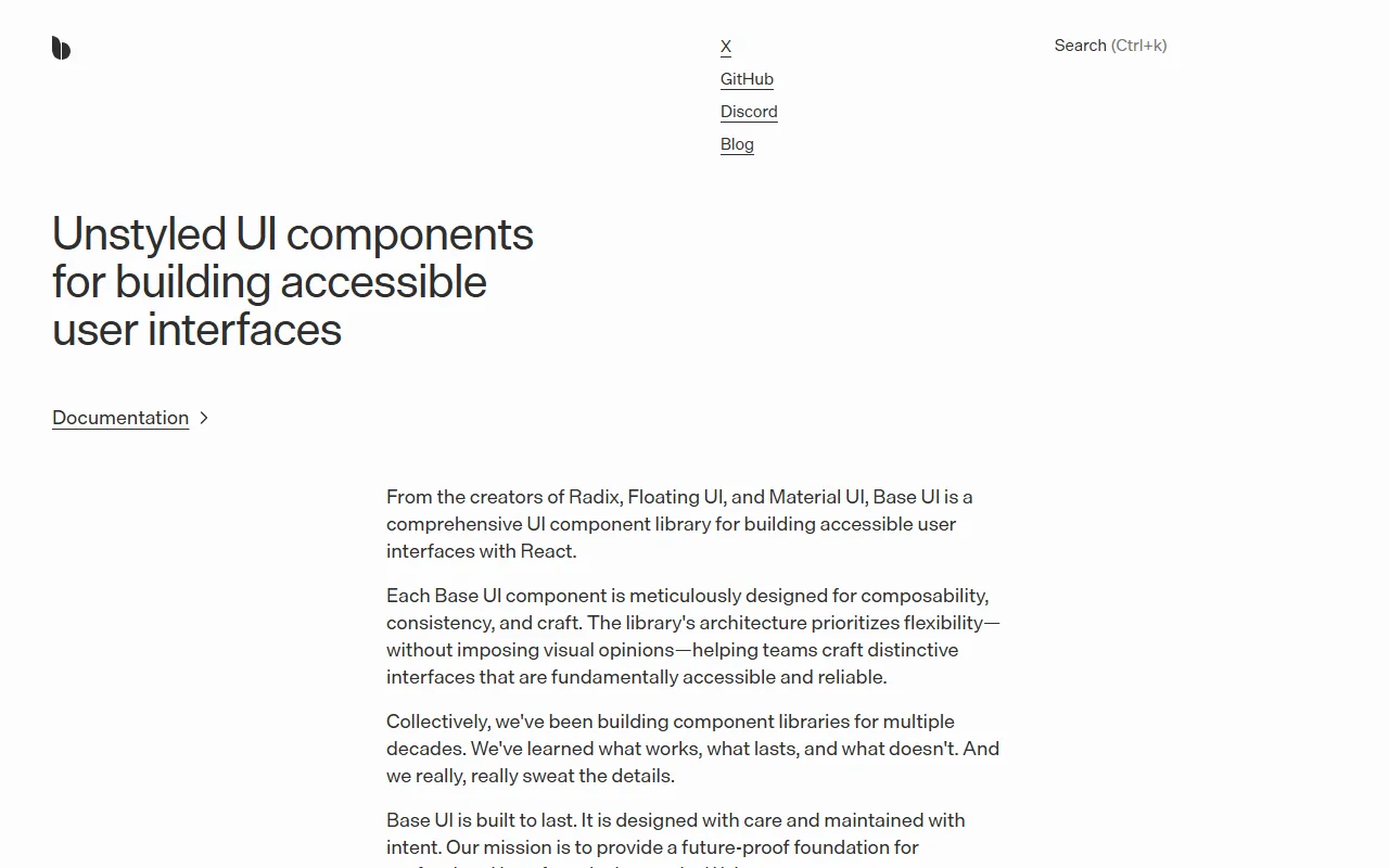
Base UI is a library of unstyled React components for accessible user interfaces. The project comes from the team behind Radix, Floating UI and Material UI.
What it does
Base UI gives you building blocks for tooltips, popovers, menus, selects, preview cards, dialogs and toasts. The behavior is handled for you, while the visual styling is left to you, so the library does not impose a look. Components are built to be composed from smaller parts, which makes it easier to create your own variants. The site says the library is meant to be a stable base for professional interface work, and its documentation explains how each part fits together.
Key features
- Unstyled building blocks for React
- Menus, selects, dialogs and toasts
- Accessibility built into each component
- Composable parts for custom variants
- Works with the styling approach you choose
Who it's for
Teams building their own design system who want accessible base behavior under their own styles. Developers who have outgrown a fixed visual theme and want to control the markup directly will also benefit from its structure.
Pricing and good to know
Base UI is open source under the MIT license. The site has an FAQ covering styling libraries, standards and the differences from Radix UI, which is worth reading before you choose it. The library is for React, so it is not a fit for other frameworks.
Highlights
- Unstyled building blocks for React
- Menus, selects, dialogs, tooltips and toasts
- Accessibility built into each component
- Composable parts for custom variants
- Works with the styling approach you choose