
About Bits UI
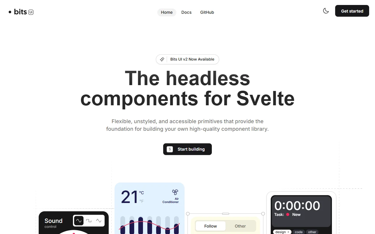
Bits UI is a set of headless, unstyled components for Svelte. It provides accessible building blocks for your own component library.
What it does
Bits UI handles behavior, state and keyboard interaction for interface elements such as menus, dialogs and similar controls. You supply all the styles, so the library does not impose a visual look on your app. The components are designed to be predictable and consistent, which helps when a team builds many screens. The site presents version 2 as the current release, and the documentation covers how each part is used.
Key features
- Headless, unstyled Svelte components
- Accessible behavior built in
- You control all styling
- Consistent patterns across components
- Version 2 documented on the site
Who it's for
Svelte teams building their own design system who want reliable interaction code without a fixed theme. Developers who like accessible primitives and enjoy writing their own styles will find it a good match.
Pricing and good to know
Bits UI is open source under the MIT license, so it is free to use. Since no visual theme ships with it, expect to write your own styles and layouts. The site links to the GitHub repository and the change log, which are the places to check for release details.
Highlights
- Headless, unstyled Svelte components
- Accessible behavior built in
- Full control over styling
- Consistent patterns across components
- Version 2 documented on the site