
About PrimeNG
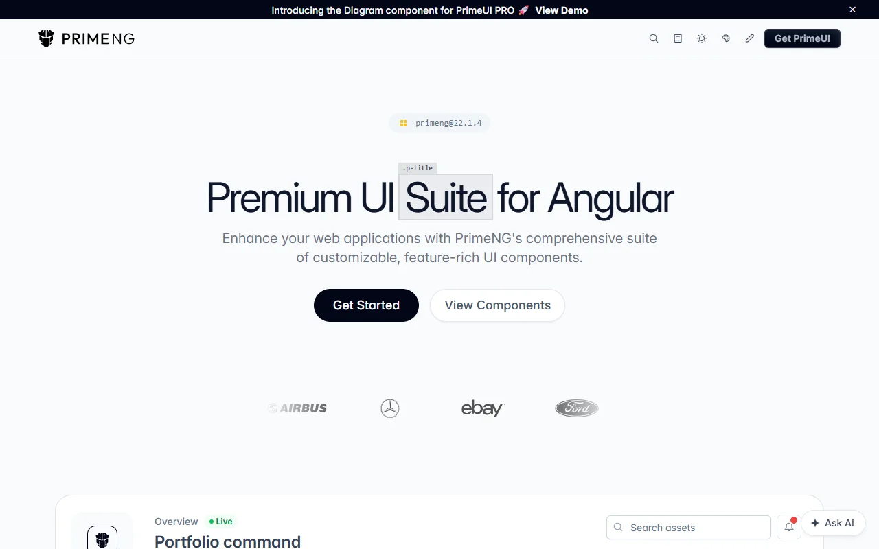
PrimeNG is a suite of Angular UI components that stays independent of any one visual design. It uses theme presets and a layered API to adjust the look of each part.
What it does
PrimeNG provides Angular components with templates and styled variants, along with theming through design tokens. The library includes sliders, dialogs and data tables, and the docs show how each one is used with Angular forms. Components can be used in several layers, from headless logic to fully styled output, so you can choose how much of the look you want to control. A premium PrimeUI suite offers additional components on top of the free library.
Key features
- Angular components with theme presets
- Design token theming
- Headless and styled layers
- Dialog, slider and table components
- Premium PrimeUI suite offered separately
Who it's for
Angular teams that want a large component library with ready-made looks. Developers who need custom components in an existing app, and dashboard builders who rely on tables and dialogs, will find it a practical choice.
Pricing and good to know
The free library is available to use, and the project also offers a premium PrimeUI suite. The site does not show a license for the free library, so check the repository and the terms of each part before you use it in a product. Components work with Angular forms through the standard ngModel binding.
Highlights
- Angular components with theme presets
- Design token theming
- Headless and styled component layers
- Dialog, slider and table components
- Premium PrimeUI suite offered separately