About PrimeReact
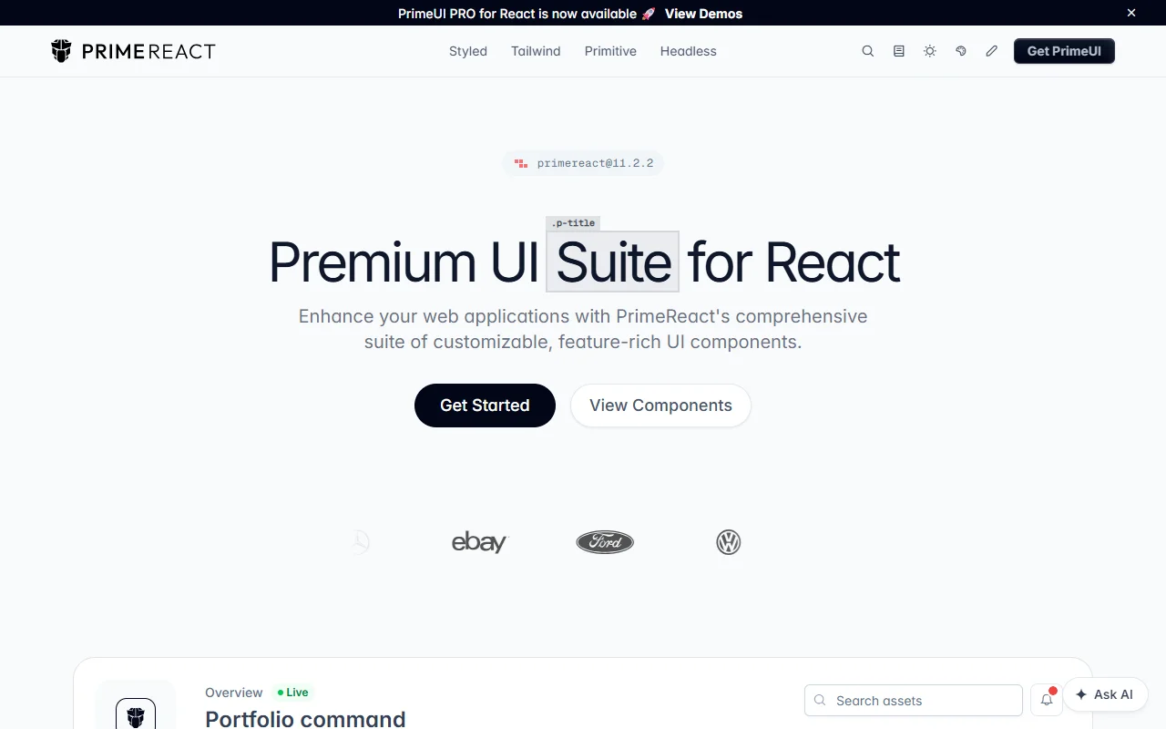
PrimeReact is a suite of React UI components that works with different styling approaches. It covers common app needs such as sliders, dialogs and inputs, and it is aimed at teams that want a large set of components without much setup.
What it does
PrimeReact components are built in layers, from headless logic to fully styled versions, so you can pick the level that fits your project. Theming uses presets and design tokens to change colors, spacing and border radius, either globally or per component. The docs show examples that use styled components, Tailwind and headless hooks, so you can see how each layer looks in practice before you commit to one.
Key features
- Headless, styled and Tailwind layers
- Theme presets built on design tokens
- Slider, dialog and input components
- Import a component and pass it your data
- A separate premium PrimeUI PRO suite
Who it's for
React teams that want a wide component set with little boilerplate. Dashboard builders and designers who want to change the look without rewriting each component will also find it useful, especially if they prefer to start from a theme.
Pricing and good to know
PrimeReact is open source under the MIT license, so the core library is free. The site promotes a premium PrimeUI PRO suite for React as well, which is a separate product, so check its terms before you add it to a project. The install is a single npm package, and the component import pattern is shown on the home page.
Highlights
- Headless, styled and Tailwind component layers
- Theme presets built on design tokens
- Slider, dialog and input components
- Components imported with a single npm package
- Premium PrimeUI PRO suite offered separately