
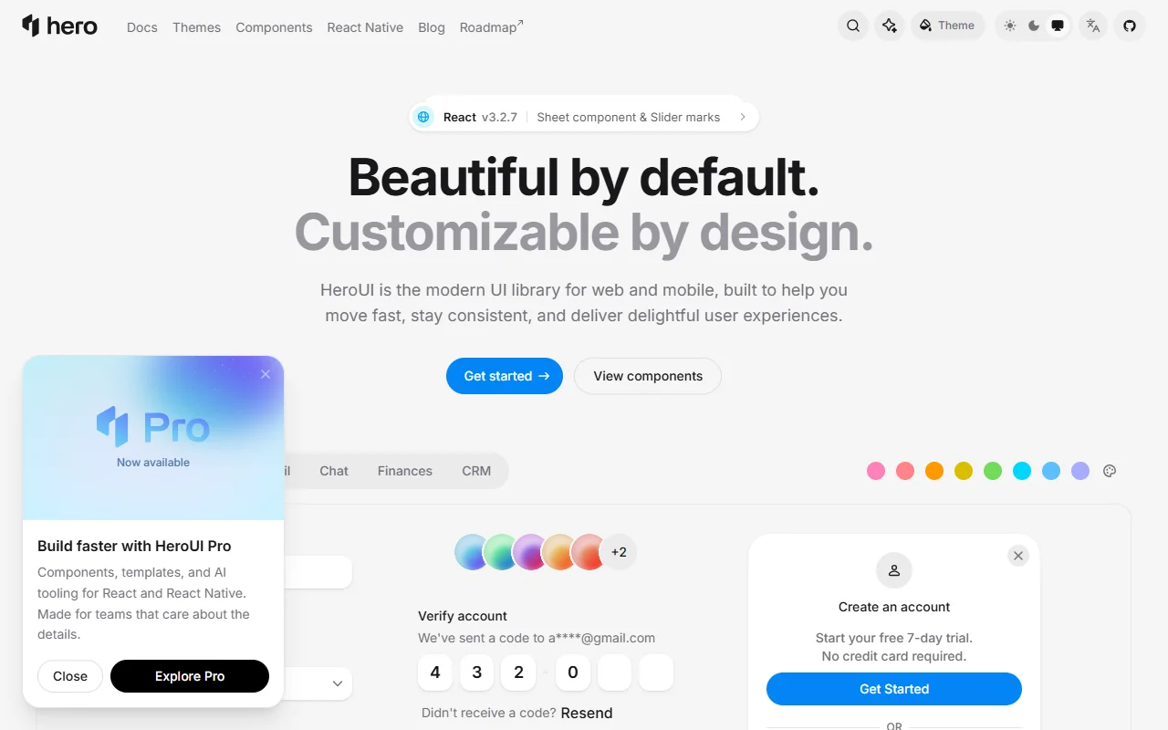
About HeroUI
HeroUI is an open source component library for React web apps and React Native. It combines React Aria components with Tailwind CSS v4 to provide accessible behavior and polished default styles.
What it does
HeroUI provides styled components that you can adjust to fit your own design system. The web library is built on React Aria Components and Tailwind CSS v4, so keyboard and screen reader behavior is handled for you. The documentation includes installation guides, component APIs, theming references, a CLI guide and migration notes. Separate packages cover mobile apps, so the same design approach can carry over to a React Native project with its own version number.
Key features
- Components for React web and React Native
- Built on React Aria for accessible behavior
- Styling with Tailwind CSS v4
- Theming and typed component APIs
- Docs with migration and CLI guides
Who it's for
Developers building React or React Native products who want ready-made components that still match a custom brand. Teams that already use Tailwind CSS will find the setup familiar, and teams that ship both web and mobile can keep one visual approach.
Pricing and good to know
The source code is open and the packages are free to use. Pro templates are sold separately, so the dashboard and mail layouts shown on the site may need a paid plan. The web and native libraries have separate version numbers, so check the release notes when you upgrade either one.
Highlights
- Components for React web and React Native
- Accessible behavior from React Aria Components
- Styling with Tailwind CSS v4
- Theming with typed component APIs
- Installation, theming and CLI guides