
About React Aria
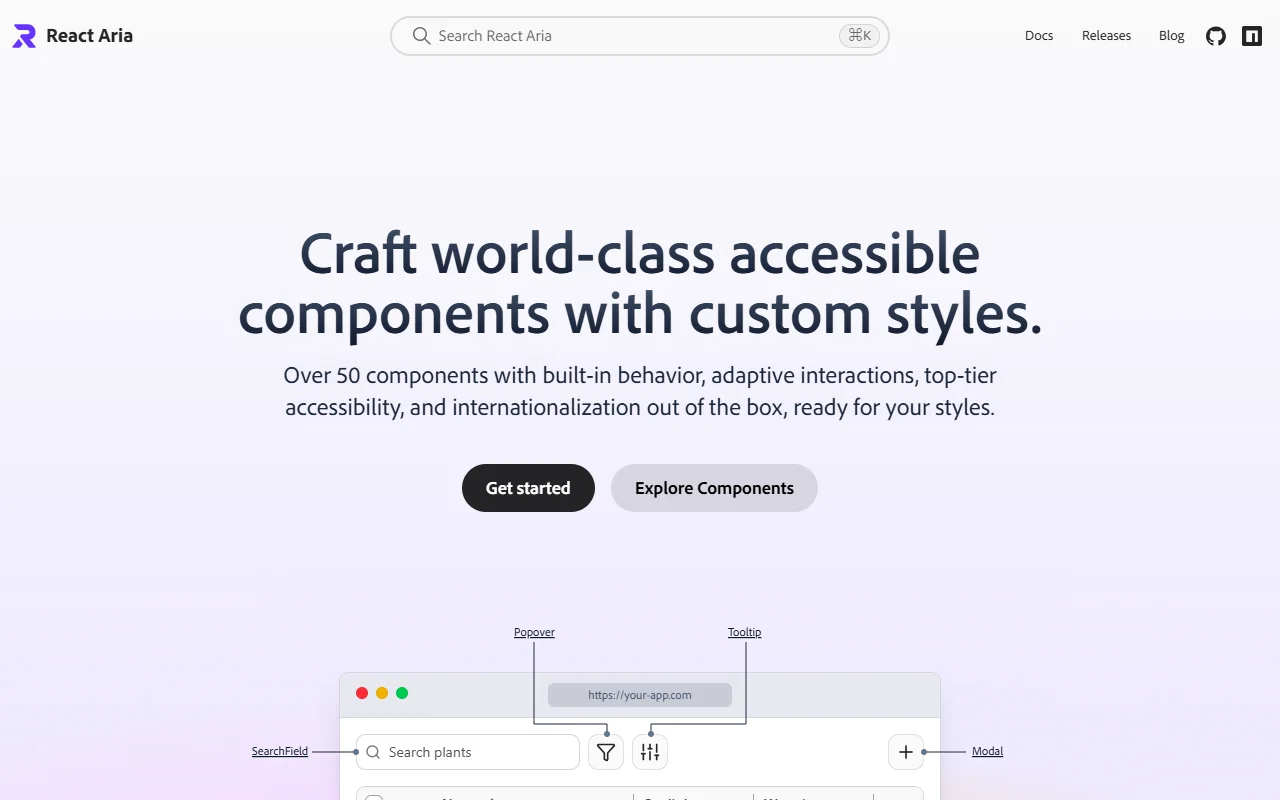
React Aria is an Adobe library of hooks and components for accessible web interfaces. It handles behavior and accessibility while you stay in control of the styling.
What it does
React Aria offers more than 50 components with built-in interactions, internationalization and keyboard support. Components are split into individual parts with render props and slots, so you can style each piece separately. The examples on the site show date pickers, popovers, tables and menus built with plain CSS, Tailwind and CSS-in-JS. If a ready-made component does not match your layout, the lower-level hooks let you build the same behavior into your own components.
Key features
- Over 50 accessible components
- Built-in internationalization support
- Render props and slots for styling
- Works with plain CSS, Tailwind or CSS-in-JS
- Hooks for building custom components
Who it's for
Developers building custom design systems who need a high accessibility standard. Teams with international users will benefit from the built-in internationalization, and teams that need precise control over markup will find the hooks useful.
Pricing and good to know
React Aria is open source under the Apache-2.0 license, so it is free to use. Because it is style-free, you need to add all the visual design yourself. The library is maintained by Adobe and sits in the same repository as React Spectrum.
Highlights
- Over 50 accessible components
- Built-in internationalization support
- Render props and slots for styling each part
- Works with plain CSS, Tailwind or CSS-in-JS
- Hooks for building custom components