
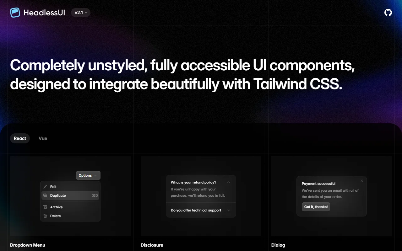
About Headless UI
Headless UI is a set of completely unstyled, accessible components for React and Vue. It is built to work well with Tailwind CSS, but it does not force any visual style on your app.
What it does
The library provides the behavior for common interface patterns such as menus, dialogs, listboxes, comboboxes, switches, tabs and disclosures. You write the markup and the styles yourself, so each component can match your design exactly. Keyboard handling, focus management and screen reader support are included, which saves you from building these details by hand. Because the components are unstyled, you can reuse the same behavior across very different layouts.
Key features
- Menus, dialogs, tabs and listboxes
- Comboboxes, switches and radio groups
- Unstyled, so you control all markup
- Works with React and Vue
- Designed to pair with Tailwind CSS
Who it's for
Developers who use Tailwind CSS and want accessible behavior without a built-in theme. Teams with a custom design system that needs reliable interaction patterns in both React and Vue will also find it a good fit.
Pricing and good to know
Headless UI is open source under the MIT license, so it is free to use. Since the components have no styles, you will write the look yourself. The copyright notice names Tailwind Labs Inc. as the owner, and the project sits alongside Tailwind CSS in the same ecosystem.
Highlights
- Menus, dialogs, tabs and listboxes
- Comboboxes, switches and radio groups
- Unstyled components that you style yourself
- Works with React and Vue
- Keyboard and focus handling built in