
About Chakra UI
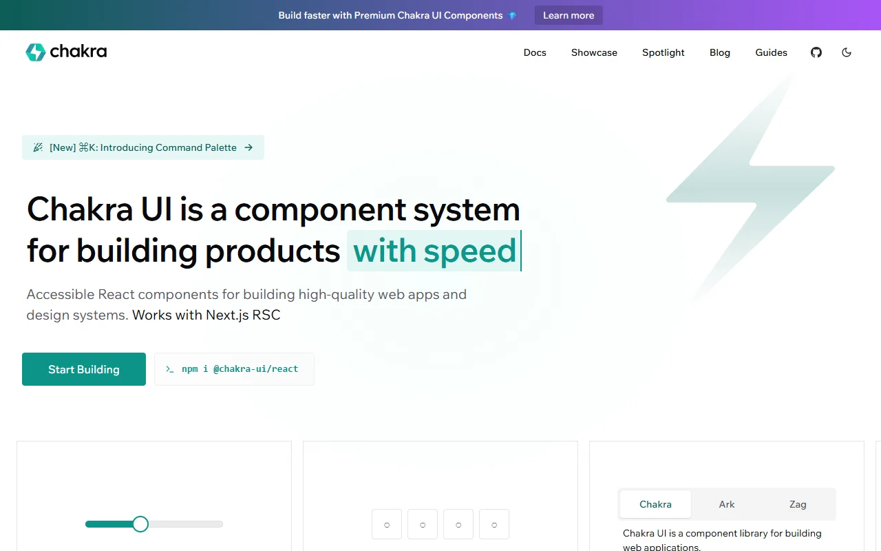
Chakra UI is a component library for building React apps and design systems. It focuses on accessible components that look good with little setup, and the theme can be changed in one place.
What it does
Chakra UI gives you ready-made pieces such as tabs, menus, sliders, pin inputs and switches. You build screens by combining these components with style props, so you write less custom CSS. A theme file holds colors, fonts and animations as semantic tokens, which keeps spacing and color decisions consistent across a product. The library also has a recipe system for component variants, so one button component can have several looks without repeated code.
Key features
- Ready-made React components
- Semantic design tokens for colors and fonts
- Recipes for component variants
- Built-in dark mode support
- Works with Next.js server components
Who it's for
Product teams and frontend developers who build React web apps and want accessible components without starting from zero. It also suits teams that plan to build their own design system on top of a tested base, since the tokens and recipes can be extended.
Pricing and good to know
Chakra UI is open source under the MIT license, so the core library is free to use. The site also mentions premium components, which are offered separately, so check their terms before planning around them. The library runs with React in the browser and installs through npm as the @chakra-ui/react package.
Highlights
- Ready-made components such as tabs, menus, sliders and switches
- Semantic design tokens for colors, fonts and animations
- Recipe system for component variants
- Built-in dark mode support
- Works with Next.js server components