
About Material UI
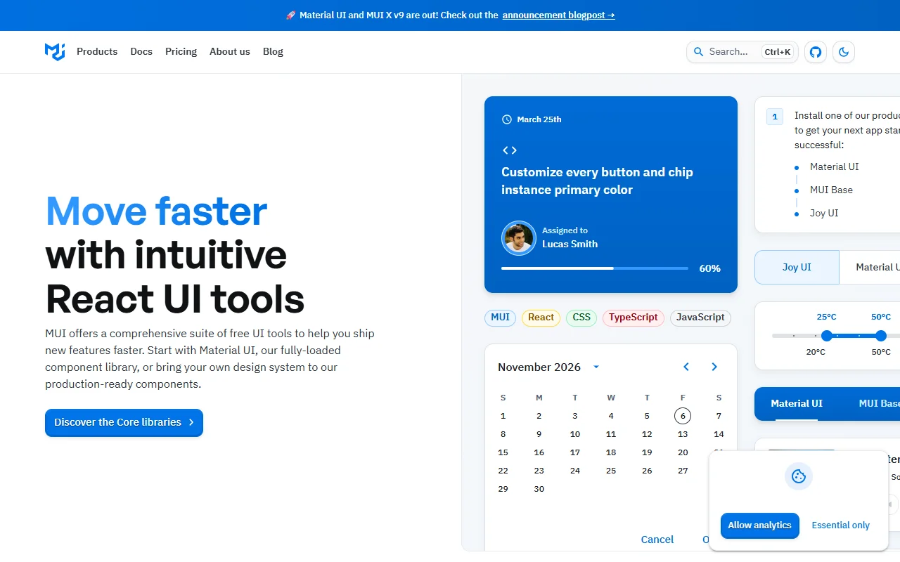
Material UI is a free React component library. It gives you ready-made interface parts that follow Google's Material Design, and you can change them to match your own brand.
What it does
The library provides buttons, inputs, navigation and layout components that are ready for production use. You can keep the default Material look or set your own theme colors, typography and spacing across the whole app. MUI X adds advanced components for complex use cases, such as data-heavy screens.
Key features
- Ready-made components for common interface needs
- Theme control for colors, type and spacing
- Material Design look available out of the box
- Advanced components through MUI X
- Templates and design kits for faster starts
Who it's for
React teams that want a complete component set and a consistent look without building every control from scratch. It also suits teams that prefer to bring their own design system and use the components as a solid base.
Pricing and good to know
The core library is free and open source under the MIT license. Check the project site for the current terms of any add-on packages before you rely on them. Like any large component set, it adds weight to your bundle, so import only the parts you use.
Highlights
- Ready-made components for buttons, inputs and navigation
- Theme colors, typography and spacing across the app
- Material Design look available out of the box
- Advanced components for complex screens with MUI X
- Starter templates and design kits