
About Nuxt UI
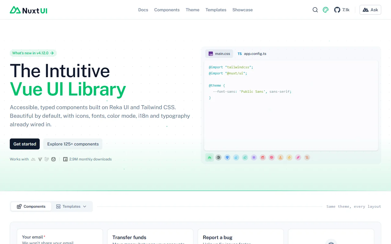
Nuxt UI is an open source component library for Vue and Nuxt. It has more than 125 accessible, typed components built on Reka UI and Tailwind CSS.
What it does
Nuxt UI provides components with icons, fonts, color mode and internationalization already set up, so a new project starts with a consistent look. Theme settings live in a configuration file and a CSS file, which keeps colors and fonts in one place. The site also shows templates and a showcase of full layouts, so you can see how the components fit together in a real screen. Because the components are built on Reka UI, their keyboard and accessibility patterns follow that library.
Key features
- More than 125 typed components
- Color mode and dark theme support
- Icons, fonts and internationalization set up
- Templates for full layouts
- Theme set in one configuration file
Who it's for
Vue and Nuxt developers who want a quick start with a consistent theme. Teams that already use Tailwind CSS will find the setup familiar, and teams with several languages can use the built-in internationalization.
Pricing and good to know
Nuxt UI is open source under the MIT license, so the core library is free to use. The site also lists a set of templates, so check which ones are free before you build on them. Styling runs through Tailwind CSS, so keep your Tailwind version compatible with the Nuxt UI release you use.
Highlights
- More than 125 typed components
- Color mode and dark theme support
- Icons, fonts and internationalization set up
- Templates for full layouts
- Theme set in one configuration file