
About Ark UI
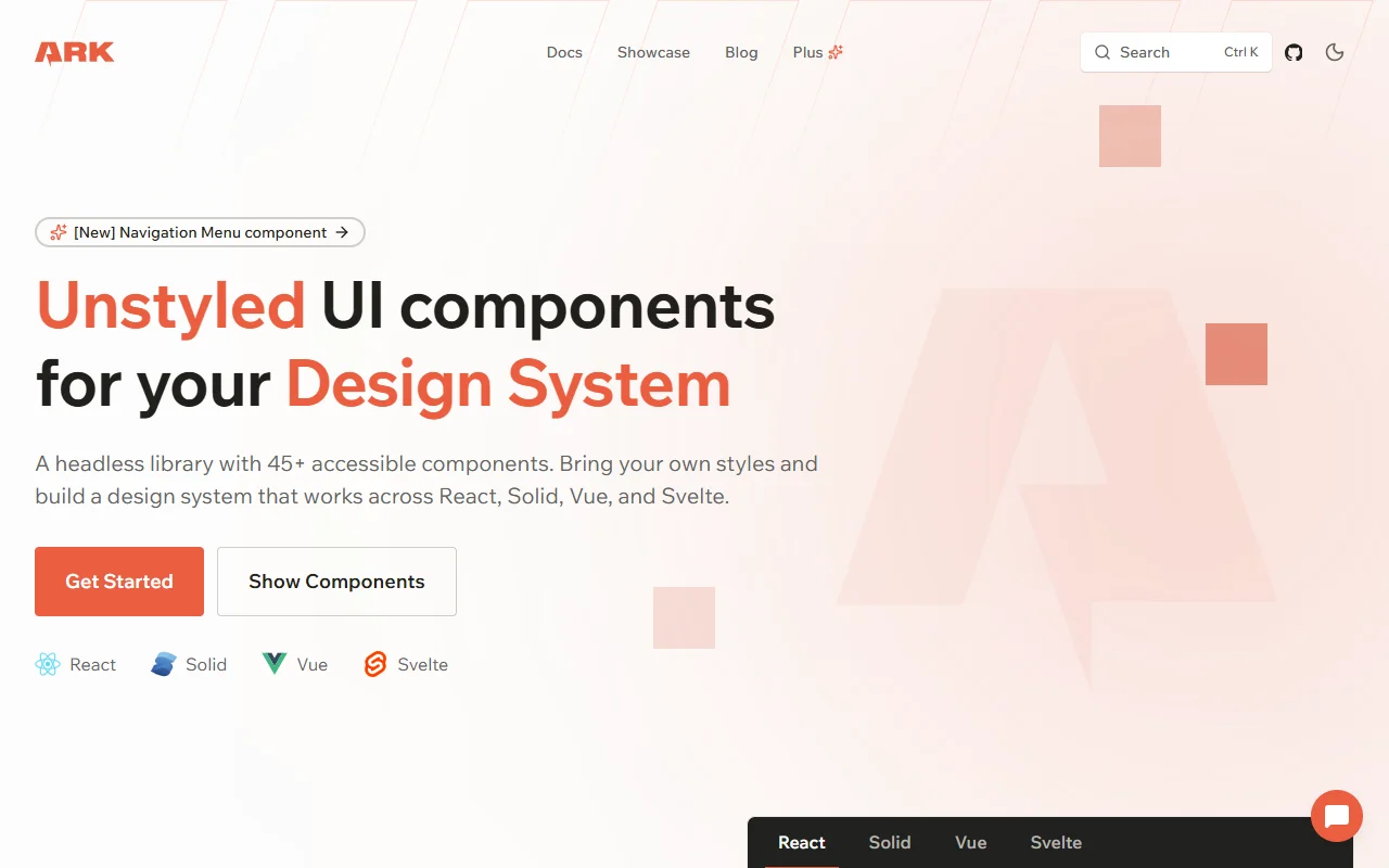
Ark UI is a headless component library with more than 45 accessible components. It works across React, Solid, Vue and Svelte with one API.
What it does
Ark UI provides unstyled components that handle state, keyboard use and ARIA patterns. You bring your own CSS, whether that is Panda CSS, Tailwind, CSS-in-JS or plain stylesheets. The components are built on state machines, so complex interactions follow predictable rules and cover edge cases. The library is aimed at teams that want a reusable design system which runs on more than one framework, with the same component names and props in each.
Key features
- More than 45 headless components
- Same API for React, Solid, Vue and Svelte
- State machine based behavior
- ARIA patterns and keyboard navigation built in
- Works with Panda, Tailwind or plain CSS
Who it's for
Teams that maintain one design system across several frameworks, and developers who want full control over every style. It is also a good fit for component library authors who need a stable headless base.
Pricing and good to know
Ark UI is open source under the MIT license, so it is free to use. Because it is headless, you will write all the styling and layout yourself. The docs also explain the state machine details, which helps if you need to customize how a component behaves.
Highlights
- More than 45 headless components
- Same API across React, Solid, Vue and Svelte
- State machine based component behavior
- ARIA patterns and keyboard navigation built in
- Works with Panda, Tailwind or plain CSS