About styled-components
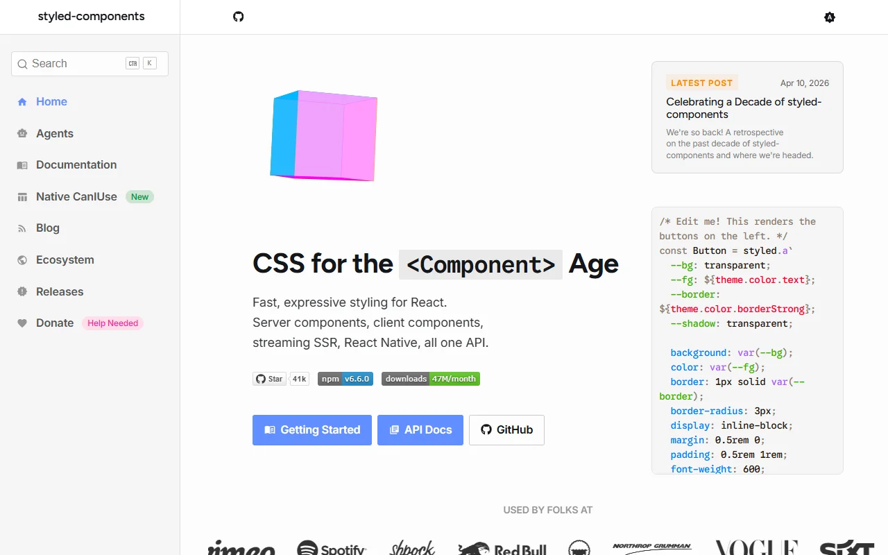
styled-components is a CSS-in-JS library for React. You write component styles inside JavaScript using tagged template literals.
What it does
styled-components creates React components with styles attached, and those styles can use props and theme values. It supports server components, streaming server-side rendering and React Native through the same API. Styles can be nested and can use pseudo-classes, media queries and CSS variables. Because the styles live next to the component, a change to a button's look happens in the same place as its code, which makes components easier to reason about.
Key features
- Styled components using tagged template literals
- Prop-based and theme-based styling
- Server components and streaming SSR
- React Native support
- Installs with a single npm package
Who it's for
React teams that prefer to keep styles beside their components. Developers who want theming through props and component libraries that need styles to ship with each part will find it a good match.
Pricing and good to know
styled-components is open source under the MIT license, so it is free to use. The site suggests the Babel plugin for clearer class names, smaller bundles and better server rendering, though it is optional.
Highlights
- Styled components using tagged template literals
- Prop-based and theme-based styling
- Server components and streaming SSR
- React Native support
- Installs with a single npm package