
About Utopia
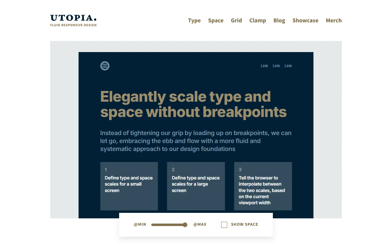
Utopia is a way of thinking about fluid responsive design, with a set of free calculators to support it. Instead of designing for many breakpoints, you define a small-screen scale and a large-screen scale and let the browser move between them.
What it does
You set type and space scales for a small screen and for a large screen. The browser then interpolates between the two as the viewport width changes. The free calculators help you build these scales for type, space and grids, and show the CSS that results. The site also has articles and examples from designers and developers.
Key features
- Type calculator for fluid font sizes
- Space calculator for fluid spacing
- Grid calculator for fluid layouts
- Fluid scales that adjust between two viewport widths
Who it's for
Utopia suits designers and developers who want a steady system for layout and type without many breakpoints. It is especially useful for teams that want design and code to use the same scales.
Pricing and good to know
The calculators are free, and there is nothing to install or pay for to use the method. The site notes that Utopia is not a product, a plugin or a framework. The approach asks for a change in mindset, so it helps to read the articles before you apply the calculators to a live project.
Highlights
- Build fluid type scales with a calculator
- Build fluid space scales for padding and gaps
- Build fluid grids with a grid calculator
- Set a small and large scale for the browser to blend